Oct 3, 2025
When Branding Feels Like a Whisper, Not a Shout
Some brands don’t chase attention - they command it quietly.
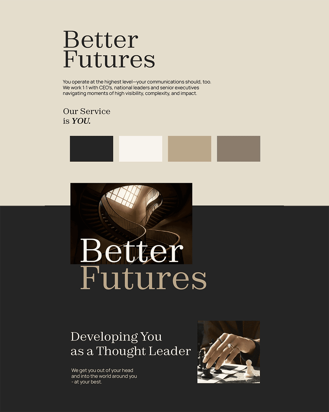
Better Futures was one of those rare projects where less truly meant more. A referral-only business that operates at the highest level, Better Futures needed a brand that didn’t need to sell itself - just gently open the door to the right people.
The Vision
The brief was simple yet profound: create an identity that feels like an invitation, not a pitch. The founder described the tone as “members club meets luxury spa” - discreet, polished, exclusive. That vision shaped every design choice, from the restrained color palette to the thoughtful typography that blends confidence with calm.
The Aesthetic
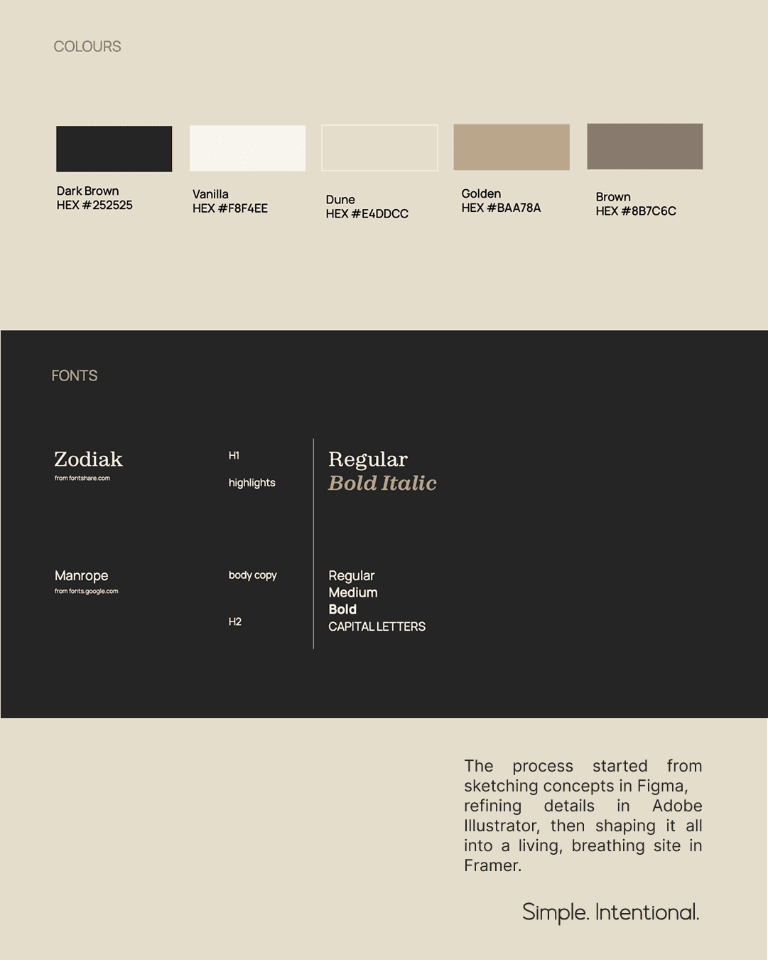
The brand is rooted in New York minimalism but softened with earthy sophistication. The tones - Dark Brown, Vanilla, Dune, Golden, Brown - reflect stability, intellect, and warmth. Together they evoke the world of private offices, refined interiors, and quiet power.
For typography, we paired Zodiak for timeless editorial character with Manrope for clean readability. The result feels both established and modern - a blend of tradition and forward-thinking precision.
The Process
The project began with conceptual sketches in Figma, exploring the emotional direction and rhythm of the brand. I refined details in Illustrator, shaping the logo and color balance to match the founder’s understated confidence. Finally, the design evolved into a Framer website - smooth, intentional, and alive.
The layout was built to breathe. Space, movement, and contrast guide the user’s attention without overwhelming. Instead of pushing for conversion, the website gently draws you in - like a private conversation that you’re invited to join.
The Essence
Better Futures isn’t about loud messaging or persuasive headlines.
It’s about clarity, presence, and trust.
The result is a brand identity that mirrors its audience CEOs, national leaders, senior executives - people who already operate at the highest level and expect design to meet them there.
A calm authority. A confident whisper. A digital presence that feels personal, discreet, and timeless.
See the website


